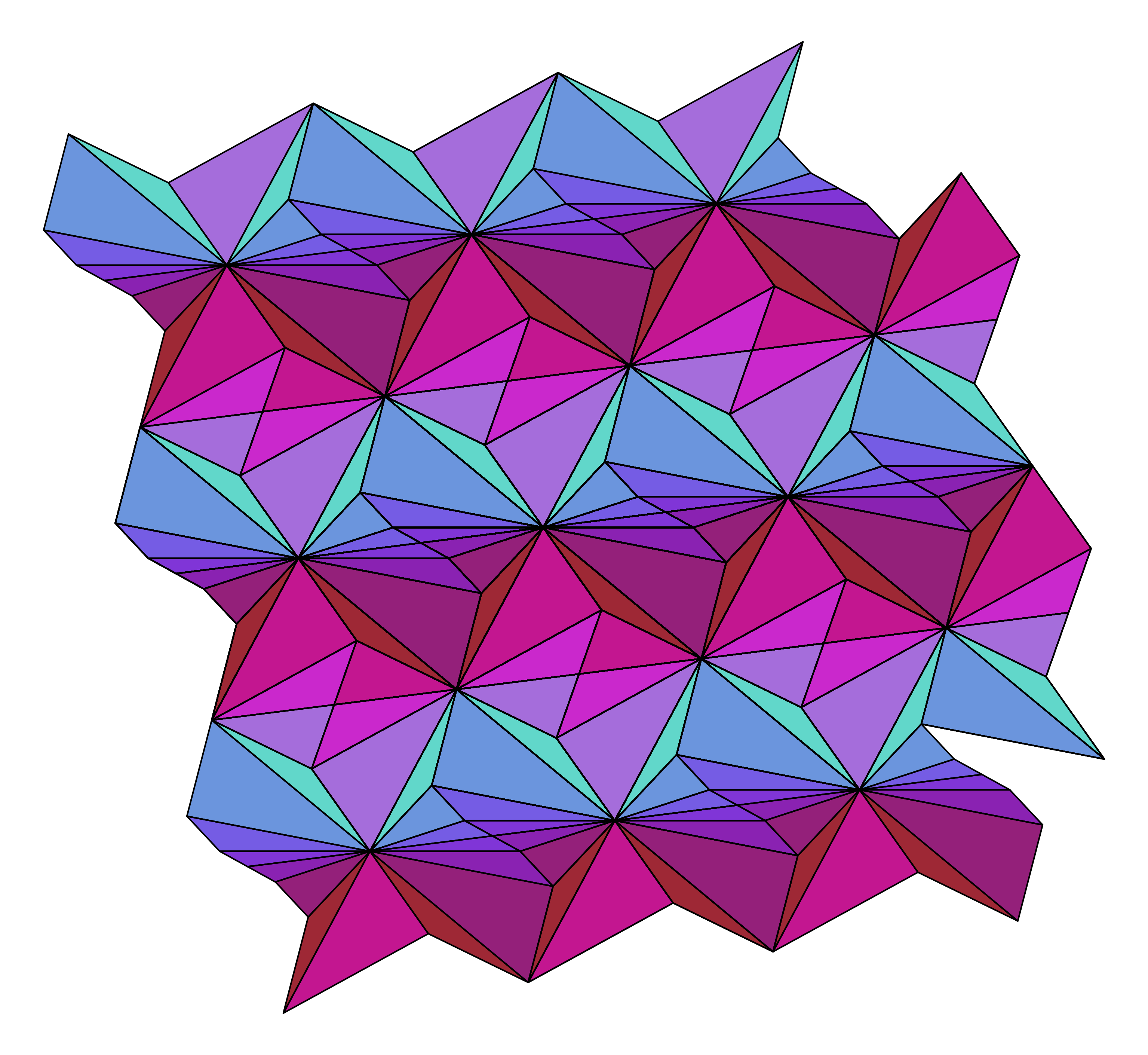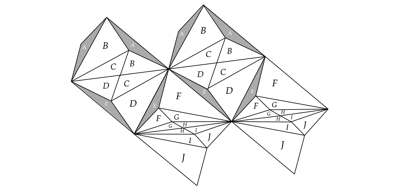
The above triangulation comes from my recent paper and shows a fundamental domain that can tile the plane. Here is a coloring problem: I want to color the above triangulation such that
My solution to this coloring problem led to some nice pictures, so I thought I would write it up. Let \(\alpha\) be the color of A and \(\alpha^c\) be its complement. What we want is two distinct ways to interpolate between \(\alpha\) and \(\alpha^c\). If we only wanted one interpolation, we could just linearly interpolate between them. But the linear interpolation is unique, so we need to find something else.
Computers store colors as a triple of values, each representing an intensity of either red, green, or blue (rgb). Classically, these are values between 0 and 255, but we may as well divide by 255 to get values between 0 and 1. Since we can represent colors as three values between 0 and 1, each color is a point inside a cube:
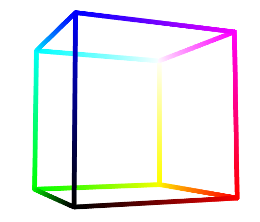
The color cube. You can interact with the image here.
The cube has a red axis, a green axis, and a blue axis. The origin \((0,0,0)\) is black and the opposite point \((1,1,1)\) is white. Let's sample some points:
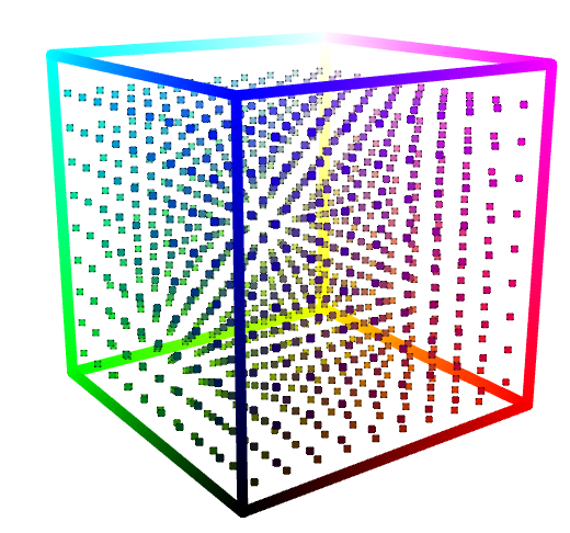
You can interact with the image here.
The complement of a color is the color you need to add to get white. In other words, if you have a color given by \((r,g,b)\), then its complement is \((1-r,1-g,1-b)\). It follows that the complement of a color in the color cube is given by a sequence of three reflections.
I wanted the color of label A to be the link color I use for this website. We'll plot that color and its complement.
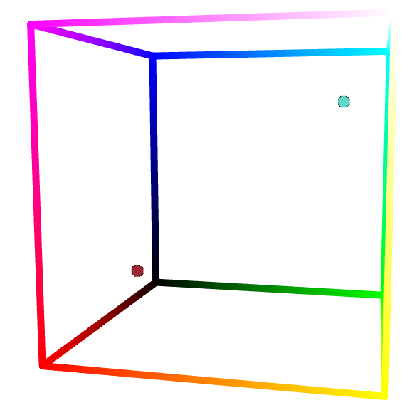
You can interact with the image here.
The first instinct for getting a gradient between two colors is to sample along a linear interpolation. We can visualize that really nicely:
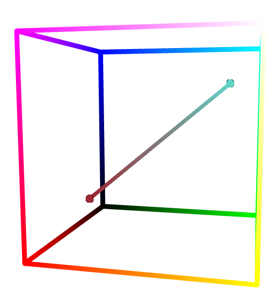
The linear interpolation. You can interact with the image here.
Looking at that picture makes it clear what we should be doing: we need to find two paths between the two points. We can then sample along those paths to color the original triangulation picture. Luckily, there are many, many (many) such paths. So the rest is art: we'll look for paths that look good.
Here is a first attempt:
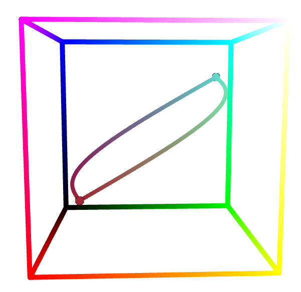
You can interact with the image here.
This is nice because the two paths are quite distinct, but there is a mucky yellow in there that I don't like.
What I ended up with was the following:
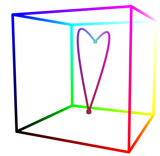
You can interact with the image here.
Even though the paths are closer together, the effect is quite nice:
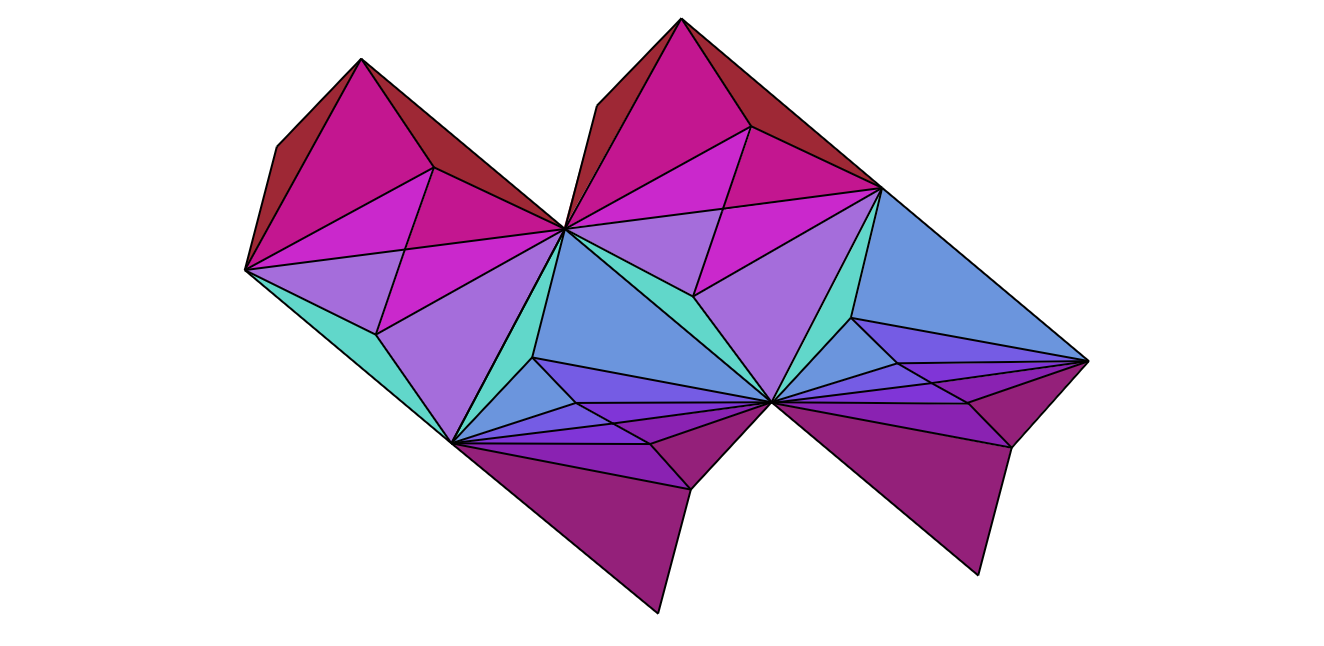
Lifting to (part of) the universal cover makes the two gradients come together. Dragging the eye from top to bottom has the effect of walking around the loop we made in the color cube: